11. Preview Tab
In the Preview tab (see image below), a preliminary version of the created table can be viewed, along with its Summary table, Chart(s), Map, Gauges, along with any other properties that have been set. Go back and change selections in the previous tabs and see how they affect the table by returning to it in the Preview tab.

Preview Tab

11.1 Pivots Section
The CommunityForce Business Intelligence Reporting Tool reports Pivot feature allows users to generate analytical data grids from within CommunityForce Business Intelligence Reporting Tool reports. The Pivot feature essentially adds extra pivot columns to the right side of the report. This is useful for comparing data over multiple categorical dimensions.
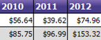
Below is an example of the Design and Output of a standard Pivot View of the Average Amount Spent on Freight.
11.2 Create a Simple Pivot Report.
- Click on the "Data Sources" tab and select desired data sources. (Ex. Orders)
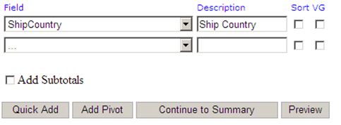
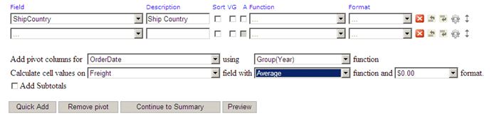
- Click on the "Fields" tab. Select the desired Field(s) names & attributes (Sorting, VG, Function, & Format) for the report. (Ex. ShipCountry)
Before Pivot:
 :
:
Create pivot view on above report:
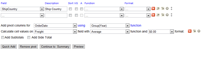
- Under Fields tab, click the "Add Pivot"
- Drop down "Add pivot columns for". Select the field you wish to display across the top of the pivot view (Ex. OrderDate). Next, select the function type from drop down (Ex. Group(Year))
- Drop down "Calculate cell values on". Select the field you wish to display down the left side of the pivot view (Ex. Freight). Next, select the function & format types from the drop downs (ex. Average & $0.00). **This field's data will also populate the rows within the pivot
- Optional: Select the "Add subtotals using" drop down and apply Advanced Settings
- Click Preview
After Pivot:
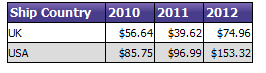
 Essentially, the pivot capability adds additional columns based on the data to the right of the report. In this example, the first column is essentially a standard report and the 2010, 2011, 2012 columns were added by the pivot capability.
Standard Report View:

Columns added by Pivot:
11.3 Create an Advanced Pivot Report
Let's use these concepts to develop a more sophisticated report that shows us a monthly time-series report for each country visually grouped by employee.
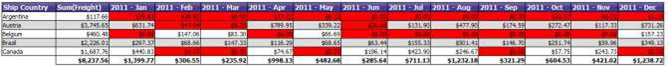
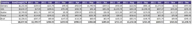
In this report, we want to show the Top 5 companies that accounted for the most freight in 2011 and breakdown the analysis by month.
Here is what the design screen would look like for this report.
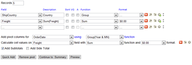 Here's how we add the non-pivot fields.
- We started off by using the same Data Source for the previous report,
- We then Select the Fields, grouping by ShipCountry, and Summing the
- Next, we check the Subtotals box to give us a summary line for each
- Then, we click on the advanced icon for the Freight field, sorting from Z-A to list the highest values
- After that, we selected 5 Records in the top left to show the 5 countries with the largest freight
For the pivot portion of the report, we:
- Select the OrderDate at the Pivot column and Year & MN as the way it will be
- Select Freight as what we will measure in our pivot, performing a sum for each column
The final step is to add the filter to make it calculate the results from only 2011 data.

Finally, here are the results of the report with Pivot:
To make the report more consumable, you might also want to add highlighting to show the months with lows values.
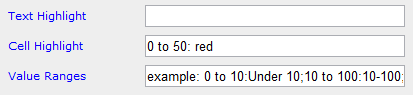
For this, click on the Advanced Field Settings icon on the pivot field where you are calculating cell values, on the far right of the image below.
Then, set the Cell Highlight to 0 to 50: Red.
Here is the result: