1. CHART TAB
In the Chart tab, a chart can be created using the data in the table/view selected on the Data Sources tab.
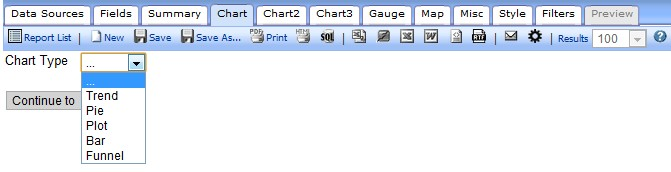
Chart Tab
The Charts Tab lets you create different variations of charts, including:
- Trend
- Pie
- Plot
- Bar
- Funnel
You can have multiple charts in one report or put multiple charts of summary information on a Dashboard to show key business metrics.
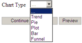
6.1 None Selection
When the chart type is None (…), no chart appears.
6.2 Trend
Section

6.2.1 Creating a Trend Chart showing Orders by Month
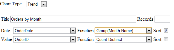

- Click on "Design a New Report"
- Click on the "Data Sources" tab. Then click on the drop down box and choose "Orders".
- Click on the "Chart" tab. This is where we create
- Click on the "Chart Type" drop down box and choose "Trend" for the chart
- Click on the "Date" drop down box and select "OrderDate" for our date
- For the "Date" function select "Group (Month Name)" from the drop down
- Click on the "Value" drop down box and select "OrderID" for our value
- For the "Value" function select "Count Distinct" from the drop down
- Click on the "Preview" tab so you can view the report. Let's add a title to this
- Click on the "Misc" tab. In the "Title" text box enter "Orders by Month"
- Click the "Preview" tab. Now the Report is Titled. Let's Save
- Click on the "Save as" tool bar button, name your report and enter the category you want the report to be shown under. Click OK. The CommunityForce Business Intelligence Reporting Tool report is
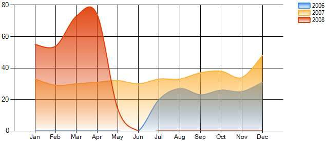
6.2.2 Creating an Advanced Trend Chart Report
In this example, we will modify the trend chart created above, by separating the data by year and smoothing out the graph.
Instructions
- In report designer just click the name. In reports list you click the pencil next to the name and this will load the report in report
- Click on the "Chart"
- Click on the "Show Advanced"
- Click on the "Separator" drop down box and select "OrderDate"
- Click on the "Separator" "Function" drop down box and select "Group (year)" this is how the data will be
- Notice that the legend check box is
- Click on the "Smooth" check box.
- Click the "Preview" tab. Now the Trend Chart has been enhanced and separated by Let's update the title for this report.
- Click on the "Misc"
- In the "Title" text box enter "Orders by Month and Year"
- Click the "Preview" tab. Let's Save
- Click on the "Save as" tool bar button, name your report, and enter the category you want the report to be shown under, click ok. The CommunityForce Business Intelligence Reporting Tool report is saved.
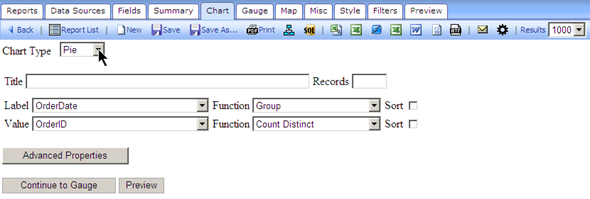
6.3 Pie Chart
The images below show the Pie (chart) selection menu of the Chart tab.
Pie (Chart) Selection
The table below describes the Pie chart selection.
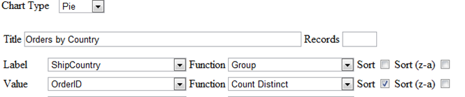
6.3.1 Creating a Pie Chart showing the percentage of orders from each country

Instructions
- Click on "Design a New Report".
- Click on the "Data Sources" tab. Then click on the drop down box and choose "Orders".
- Click on the "Chart" tab. This is where we create
- Click on the "Chart Type" drop down box and choose "Pie" for the chart
- Click on the "Label" drop down box and select "ShipCountry" for our label
- For the "Label" function select "Group" from the drop down box.
- Click on the "Value" drop down box and select "OrderID" for our value
- For the "Value" function select "Count Distinct" from the drop down box. Let's sort the values so the countries with the most orders will be
- Click on the sort checkbox for the value
- Click on the "Preview" tab so you can view the report. Let's add a title to this
- Click on the "Misc"
- In the "Title" text box enter "Orders By Country"
- Click the "Preview" tab. Now the Report is Titled. Let's Save
- Click on the "Save as" tool bar button, name your report, and enter the category you want the report to be shown under, click ok. The CommunityForce Business Intelligence Reporting Tool report is saved
6.2.3 Creating an Advanced Pie Chart Report
In this lesson, we will modify the pie chart created in the pie chart above in Figure x-x by separating the data by year so we can see which countries had the most orders each year.

Instructions
- In report designer just click the name. In reports list you click the pencil next to the name and this will load the report in report
- Click on the "Chart"
- Click on the "Show Advanced"
- Click on the "Separator" drop down box and select "OrderDate"
- Click on the "Separator" "Function" drop down box and select "Group(Year)" this is how the data will be separated. Let's limit the number of records shown to
- Click on the Show records textbox. Enter 10. Let's add a
- Click on the "Legend" check box to select it. Let's explode the largest slice from each
- Click on the "Explode Largest Slice" check box. Let's add percentages to the pie
- Click on the "Show Percentage" check box. Let's also change the type of pie
- Click on the "Chart Type" drop down box and select "Doughnut."
- Click the "Preview" tab. Now the Pie Chart has been enhanced to show the countries with the most orders separated by year. Let's update the title for this
- Click on the "Misc"
- In the "Title" text box enter "Orders By Country and Year"
- Click the "Preview" tab. Let's Save
- Click on the "Save as" tool bar button, name your report, and enter the category you want the report to be shown under. The CommunityForce Business Intelligence Reporting Tool report is

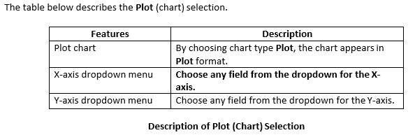
6.4 Plot Selection
The images below show the Plot (chart) selection of the Chart tab.

Plot Selection

6.5 Bar Charts
The images bellow show the user selection parameters for a simple Bar Chart which counts the number of distinct orders by country.

6.5.1 Example Bar Chart

6.5.2 Create a Bar Chart Showing the Top 15 Countries

Instructions
- Click on "Design a New Report".
- Click on the "Data Sources" tab. Then click on the drop down box and choose "Orders".
- Click on the "Chart" tab. This is where we create
- Click on the "Chart Type" drop down box and choose "Bar" for the chart
- Click on the "Label" drop down box and select "ShipCountry" for our label
- For the "Label" function select "Group" from the drop down box.
- Click on the "Value" drop down box and select "CustomerID" for our value
- For the "Value" function select "Count Distinct" from the drop down box. Let's limit the number of Countries listed on the graph to
- Click on the Show records textbox. Enter "15". Let's sort the data so we get the Top 15 countries sorted by number of
- Click on the sort checkbox for the value
- Click on the "Preview" tab so you can view the report. Let's add a title to this
- Click on the "Misc"
- In the "Title" text box enter "Top 15 Countries"
- Click the "Preview" tab. Now the Report is Titled. Let's Save
- Click on the "Save as" tool bar button, name your report, and enter the category you want the report to be shown under, click The CommunityForce Business Intelligence Reporting Tool report is saved
6.5.3 Create a Bar Chart with a Separator
Instructions
In this example, the goal is to modify the bar chart created in the preceding example by separating the data by year so we can see who the top customers were each year.
- In report designer just click the name. In reports list you click the pencil next to the name and this will load the report in report
- Click on the "Chart"
- Click on the "Show Advanced"
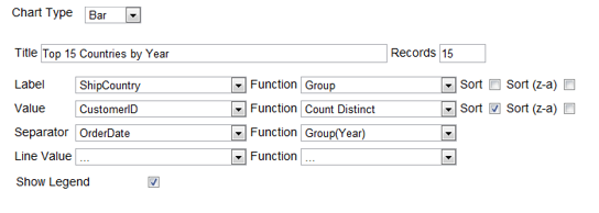
- Click on the "Separator" drop down box and select "OrderDate"
- Click on the "Separator" "Function" drop down box and select "Group (Year)" this is how the data will be
- Notice that the legend check box is
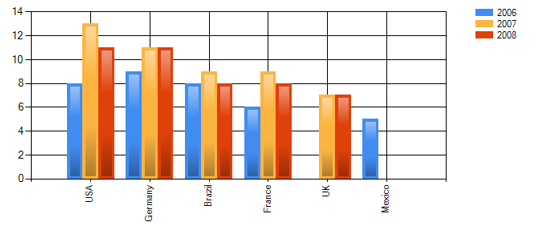
- Click the "Preview" tab. Now the Bar Chart has been enhanced to show the countries with the most customers separated by year. Let's update the title for this
- Click on the "Misc"
- In the "Title" text box enter "Top 15 Countries by Year"
- Click the "Preview" tab. Let's Save
- Click on the "Save as" tool bar button, name your report, and enter the category you want the report to be shown under, click ok. The CommunityForce Business Intelligence Reporting Tool report is saved.
6.5.4 Other Bar Chart Options
Show Pareto
In a bar graph, the bars are plotted in order of increasing x. The heights of the bars fell where they will.

In a pareto chart, the bars are plotted in order of decreasing height, so the tallest bar is on the left, and the bars get shorter as you move to the right.

6.6 Stacked
Stacked bar graph is a graph that is used to compare the parts to the whole. The bars in a stacked bar graph are divided into categories. Each bar represents a total.
If the Stacked bar graph feature is not turned on, please contact your system administrator and ask them to validate this setting, AdhocSettings.AllowStackedBarChart = true;.

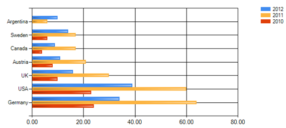
6.7 Horizontal
The selected bar chart will display the Label horizontally.
Shade Area Under Line
You can use the Share Area Under Line check box when you have a Line Value selected on the same Bar Chart.

6.8 Funnel Chart
The images below show the Funnel chart selection of the Chart tab.

